
A resource for Vanguard news, announcements and more
Vanguard maintains a segment of their site for publishing official press statements called "Pressroom." The official request from our client was for a “re-design,” but after probing a little deeper, the client disclosed the following problems that they were actually trying to resolve with said “re-design:”
As a representative who publishes press releases to the Pressroom site, I want the ability to quickly and intuitively communicate that certain releases are of high importance
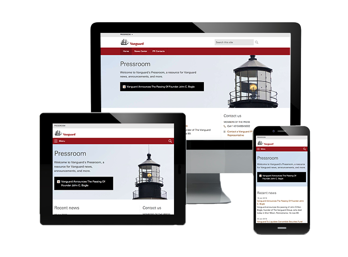
As a user, I would like the ability to view the Pressroom site on a mobile device
As a user, I find the PR contacts list to be overwhelming, and thus, difficult to parse for relevant information
As a user, I have trouble finding the press releases I am looking for, because the available filters on the “News Center” section do not reflect categories by which I desire to filter/sort.
As a user, I have trouble finding the press releases I am looking for, because the site retains and returns many more years of statements than I consider to be relevant or consumable.
I first partnered with our business clients to determine which filters we would be retiring and then consulted with the IT team to see what filters captured by the database. The database contained quite a breadth of prior years of press releases, but unfortunately, we lacked a dedicated head to implement a proposed content strategy for releases predating our changes. This meant that we were somewhat limited in our filtering/sorting options to information that was already being captured (for example, "date added"). We were, however, able to negotiate an exclusion for articles predating the year 2000, as our metrics showed that despite returning articles prior to that year, our users very rarely elected to launch them.
Next, it came time to look at the way that the content was commingled. At that time, the landing page functioned as the single point of entry for all content on the site, separated by two tabs: "PR Contacts"; and the "News Center." Dropping the user straight into the archives without a lot of context for doing so was overwhelming our users, so I explored approaches by which we further separated the content into their own sections of the site.
I proposed a new, updated design for home page, complete with a mobile-friendly, hero-style banner (meaning that the focal point scaled to appear in a prominent position, depending on your form factor) that also functioned as a section for featuring one or two press releases of the business’s choice. Said articles were dynamically pulled in through the internal content management system using a custom tag that could be affixed to any article.
As was alluded to previously, "News Center" and it's corresponding filters were allocated an entirely new page, and the overall volume was reduced to now just under 600 articles. We did persist an instance of tabbing on the new page for "PR Contacts," but in this case, the tabs served to separate US and Non-US contacts, so as not to overwhelm the user. The final solution presented many of the same capabilities as the prior version, but resulted in more intuitive content chunking and a clean design that our users continue to find easier to navigate.