
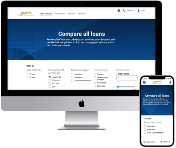
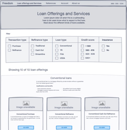
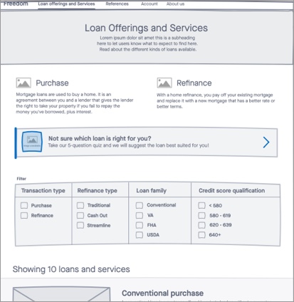
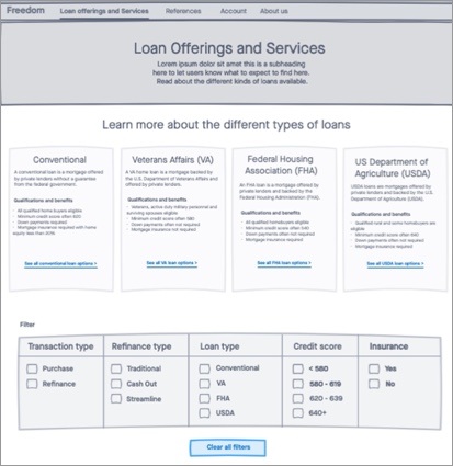
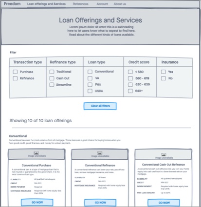
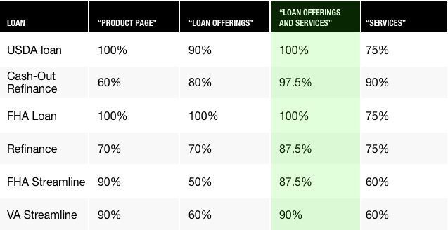
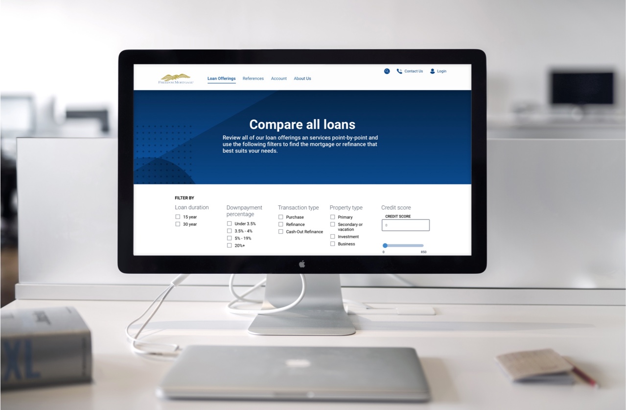
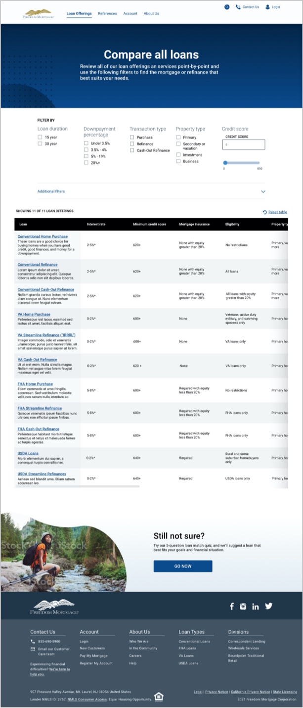
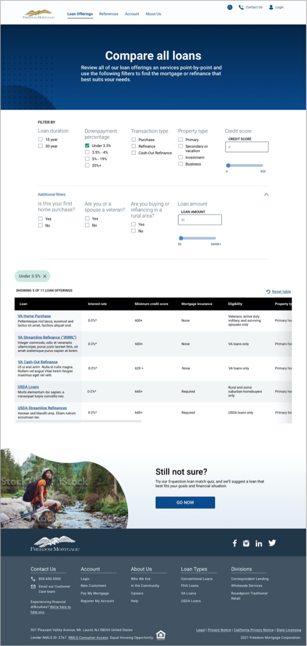
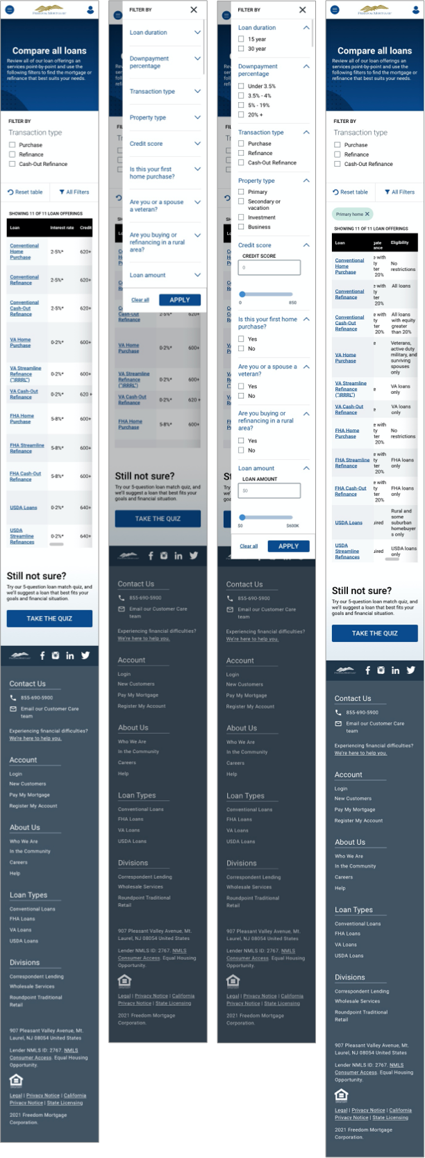
Compare all of Freedom Mortgage's products and service offerings at a glance through the use of various filters that affect the outcome of a table that lists all their points of comparison.
UX/UI Design | UX Research

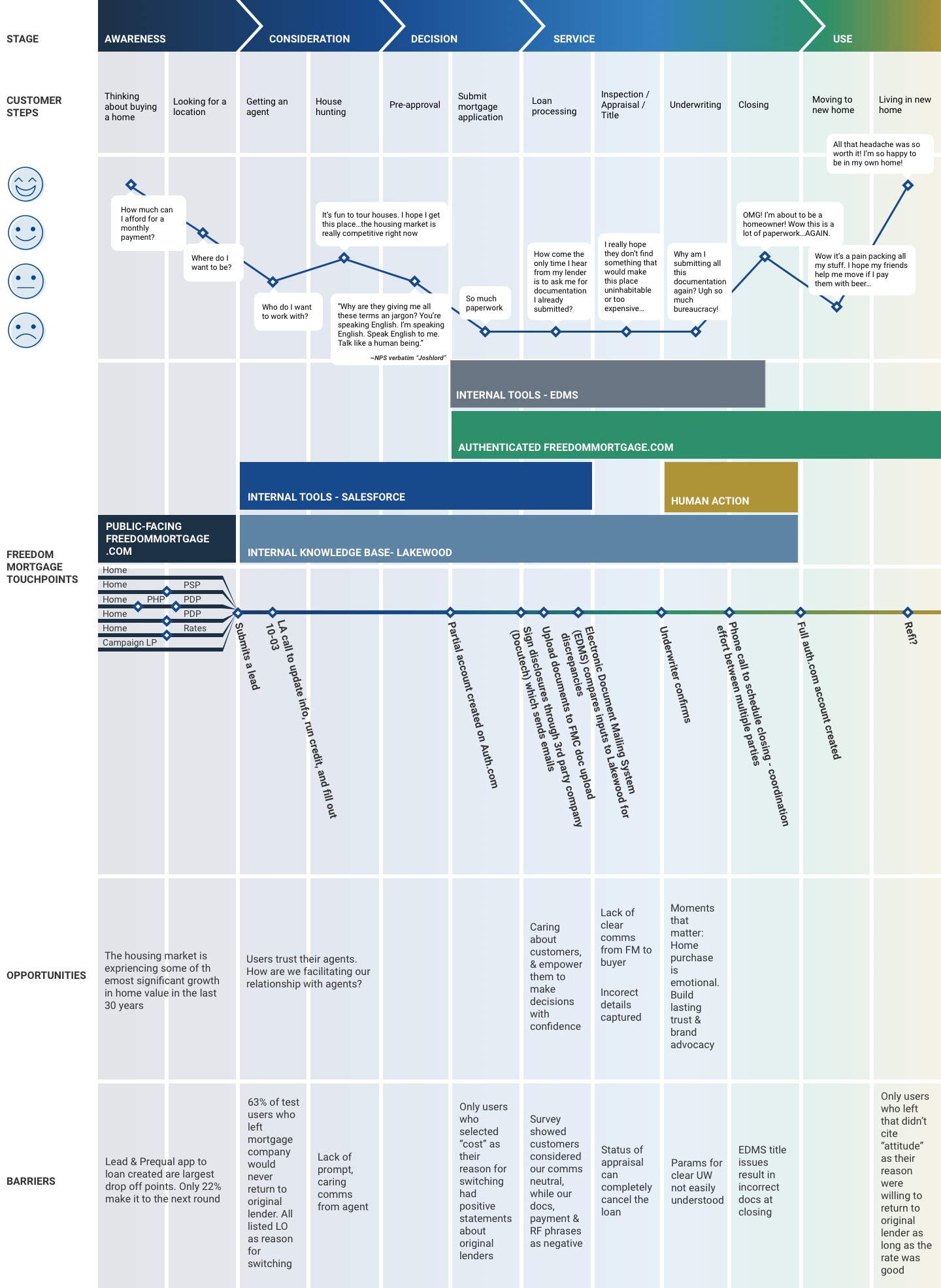
The Vision: Bring the entire homebuying process online
Why? Meet user expectations of a modern world by allowing them to finish the homebuying process where they started it.
As the Principal designer aligned to public-facing freedommortgage.com, my goal was to target touchpoints along the Path to Purchase Journey. Path to purchase = conversion. First step of the homebuying process!
Additionally, the UX team partnered with the Freedom Marketing team in a re-branding effort. This included building out a Design System, page templates and re-freshing the site design. Face-lift, and optimize for conversions.
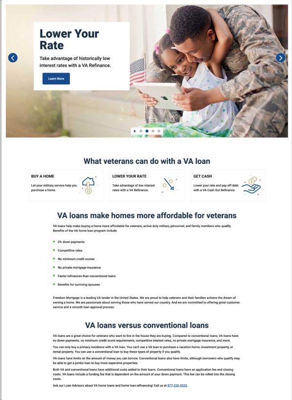
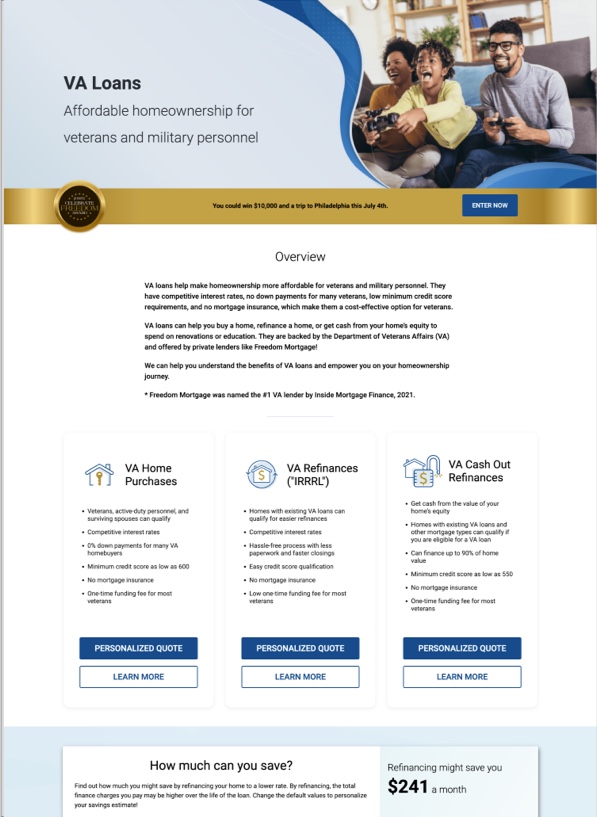
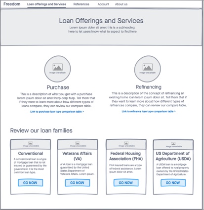
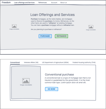
After completing the Product Details Pages, I moved one level up in the site architecture and began evaluating the IA, Content Strategy and Visual Design of the Product Suite Pages
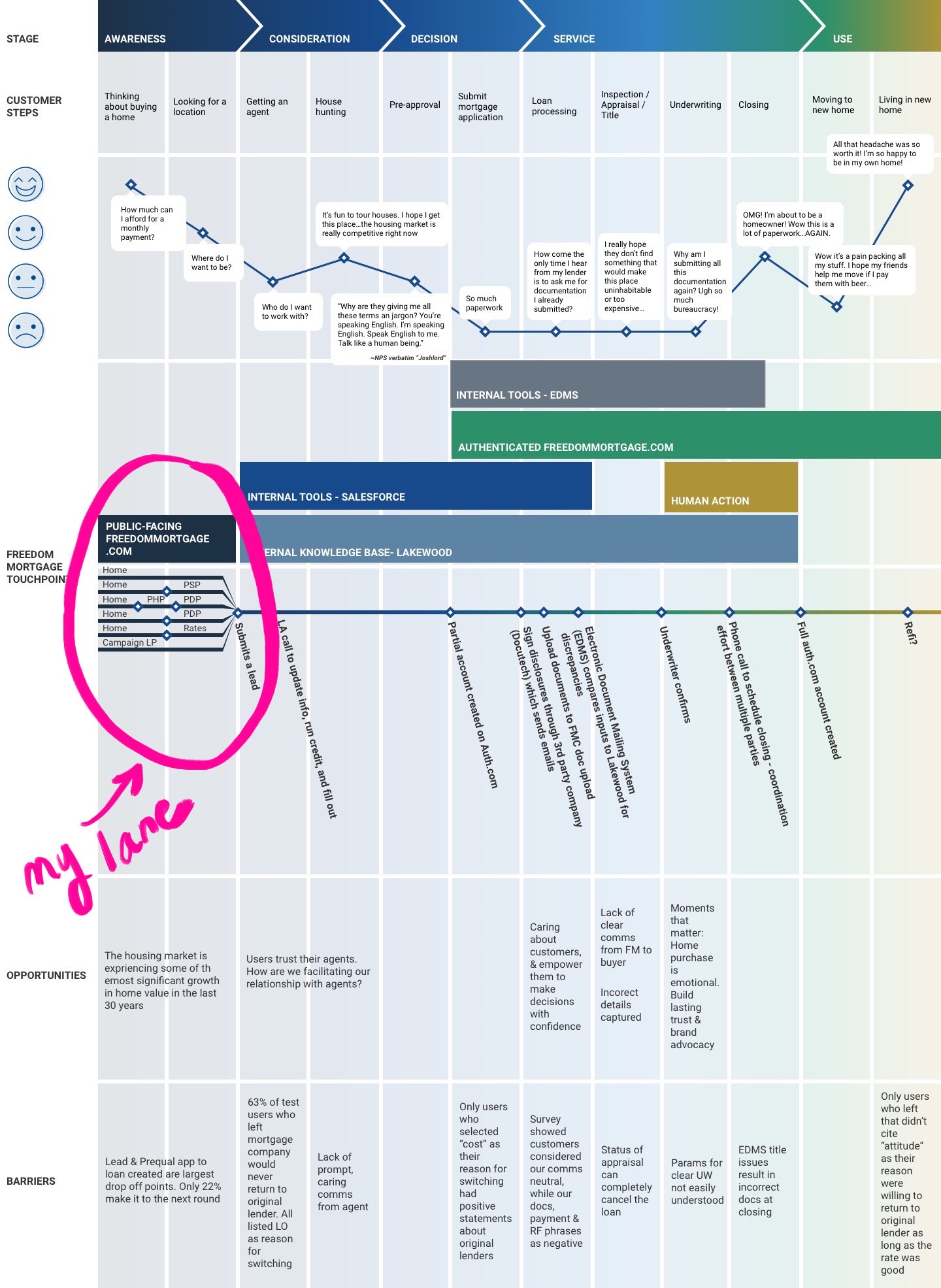
This is a high-level overview of the homebuying process that I developed as the product of a collaborative effort with the other design leads to accurately establish each touchpoint and lane purview. View the full Purchase Journey Map
This project followed a standard lifecycle, but included a few additional iterations of competitor analysis and UX Research as we gained Insights:
I tried to evaluate direct competitors, but didn't find any clear examples of product suite pages in the Mortgage industry. Most lenders had single pages dedicated to describing all product suites. Most didn't have product suite pages OR product detail pages.
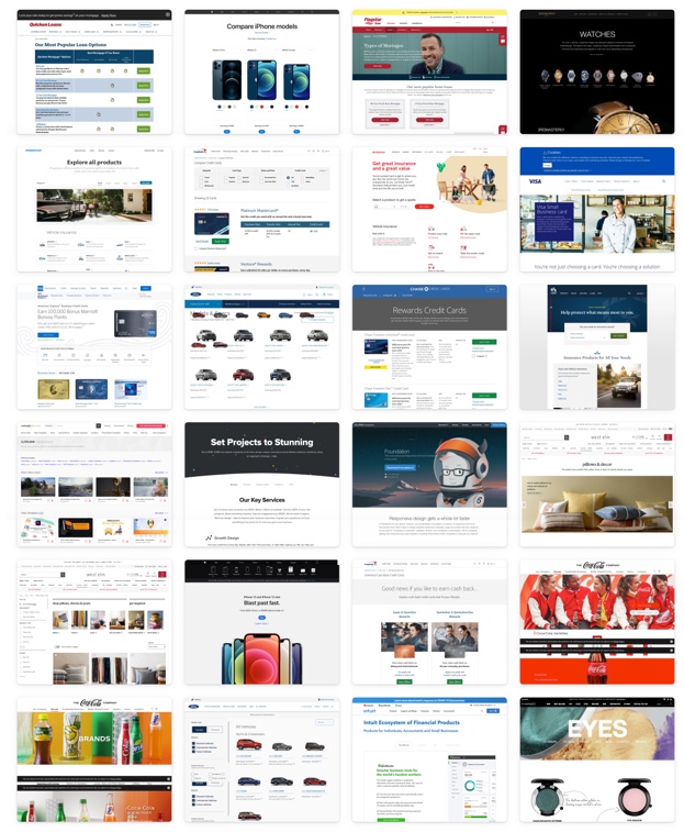
I then started looking at e-commerce, banking and other financial houses that had examples. Key non-mortgage competitors that I evaluated included:
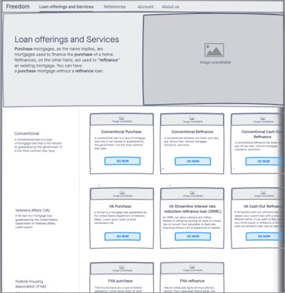
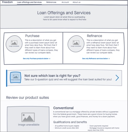
I developed a few low-concept wireframes based on my Competitor Analysis findings.
While my manager saw value in the opportunity I uncovered, it was still not yet a budgeted project. I was able to compel my Product Owner to add the Loan Compare Tool and Mortgage Match Quiz ideas to the backlog to be worked when we freed up enough time (or in secrecy), but it was not prioritized for quite some time.
Meanwhile, some other interesting things happened...
UX best practices ensure that user success metrics always be over 70%. Below 70% identifies problem areas for improvement
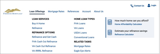
In our continued re-branding and moderniztaion efforts, we targeted key components of our site, like navigation.
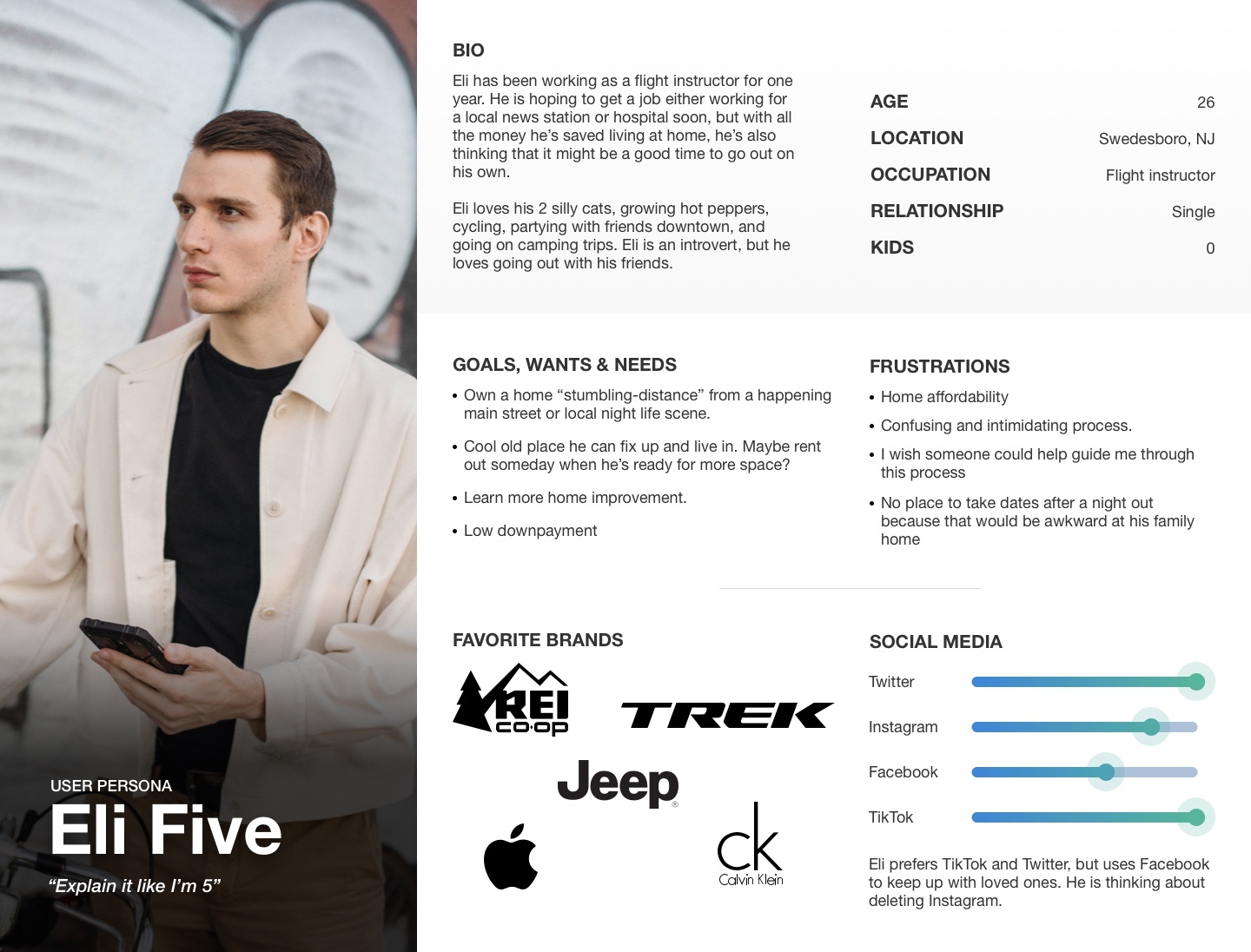
I conducted a series of card sorts to determine our main buckets and content strategy for existing high-traffic pages.
Q: "What kinds of loans do you know?"
Q: "Rank your preferred methods for being matched to a loan from this list:"
Points allocated depending on user ranking. For instance, if a user ranked a method first, it would be awarded 8 points, ranked second would be awarded 7 points, and so on. If a method was not ranked or ranked last, it would be awarded 0 points. The maximum number of points is 224 - 8 points possible for 100% of users.
If leads are king...
...and Product Detail Pages, 2 levels down in the IA, are top-converters...
...and our site architecture requires users to self-select into a product or prodcut suite to get there...
...what happens if users don't knwo the differences between the prodcuts and suites?
...because they don't
I compelled my manager and Product Owner to add the Loan Compare Tool and Mortgage Match Quiz to the backlog and prioritize it as we were able to complete other pre-prioritized tasks. Over time, we hired more designers, which helped us to get through our workload more quickly. In this time, I also began to manage direct reports.
My initial instinct was to actively work as the UX Designer and Researcher for both the tool and the quiz, but I quickly learned that as a people leader, it is better to assign complicated tasks to direct reports because the knowledge is better shared for the purpose of their growth. Additionally, the workload of having multiple complex projects AND managing people is an inefficient use of my time and resources.
I hesitantly assigned the quiz to my direct report and instead acted as the UX Strategy Lead to advise her along her design process. Instead of being in the weeds doing the work, I made high-level recommendations for her research plan, reviewed it before she launched it to make sure it was aligned with the assumptions we were trying to prove/disprove, reviewed her designs at progressive checkpoints of fidelity for quality, recommended that she use the progressive design template I had developed a few months earlier as a start, and helped talk her through problems she was experiencing along the way.
While I was disappointed to seemingly relinquish control of a fascinating part of the project, I was pleasantly surprised at how much more quickly we were able to work through the problem and how satisfying it was to watch her solve the problem in her own way and apply her learnings in future projects.
Once I'd aggregated enough research to create a compelling WIIFM, I worked with my manager to gather potential stakeholders to fund the project. We invited executives from Brand, Marketing, Digital Product, Call Center, Sales & Acquisition, Data & SEO and Content strategy.
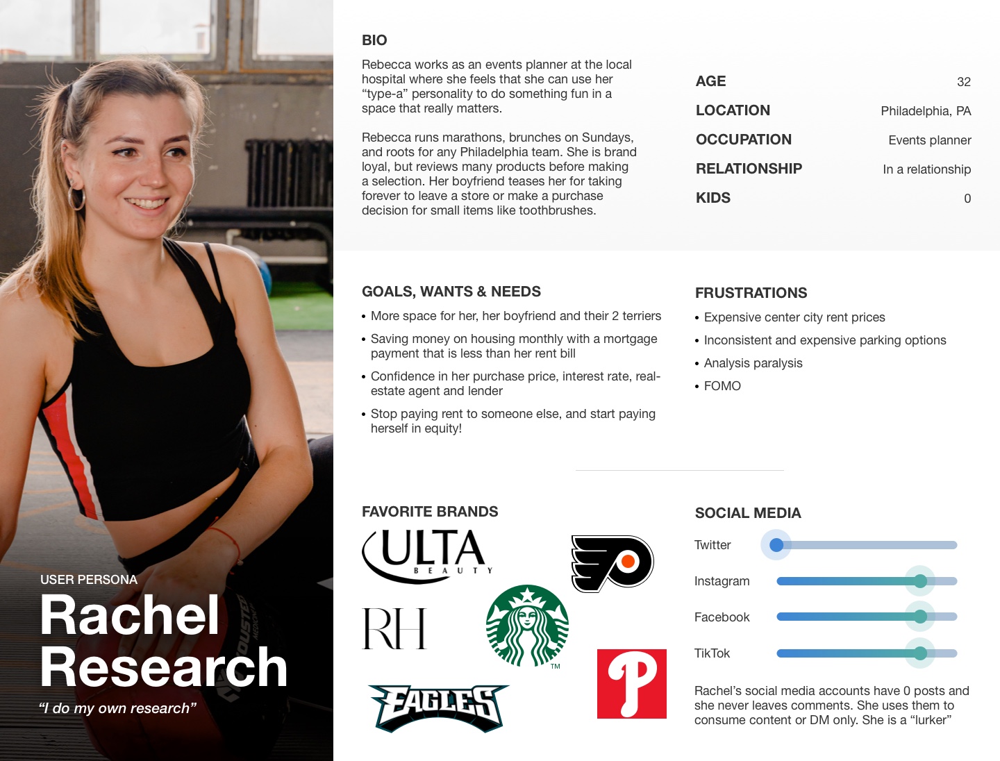
Some wondered why we wanted both a quiz and a tool if they both accomplished the same goal. We had to explain the 2 different user-types (Eli & Rachel) and how we could still be missing one or the other by only going forward with one of the 2 solutions
Despite initial skepticism from certain stakeholders, all present were enthusiastic about the idea of offering something that no other direct competitor had. My direct told me subsequently that watching me go back and forth with one stakeholder was like "watching a tennis match!"
One stakeholder not only asked how soon he could have it, but also encouraged us to apply for a patent for both the Loan Compare Tool and the Mortgage Match Quiz.
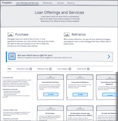
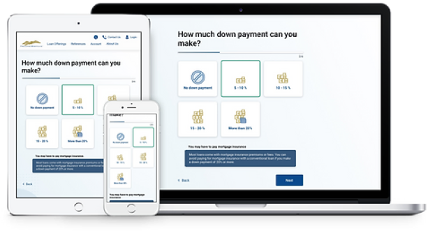
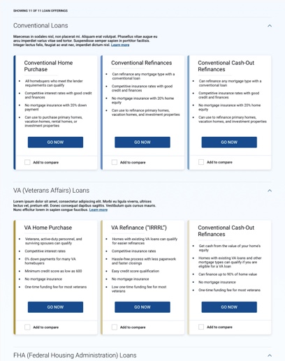
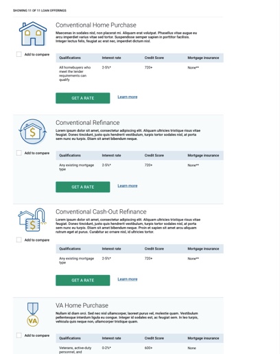
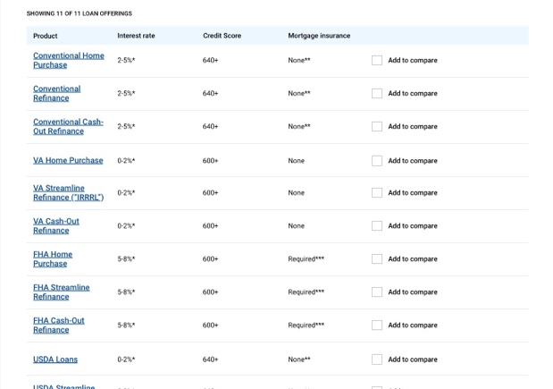
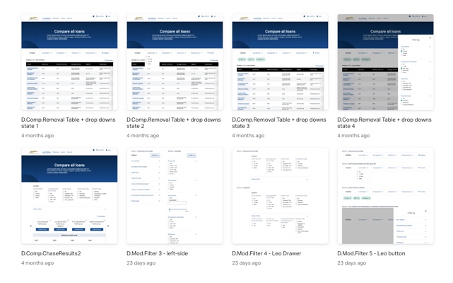
I created a mid-fidelity mockup based on the card tile layout that had more qualifications listed out, per the outcomes of the low concept testing. I was also urged to re-visit single-item row layouts, despite performing poorly in research. I also added an "add to compare" checkbox so the user could create a custom comparison table with their product selections.
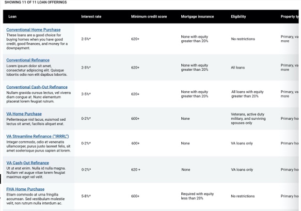
I ultimately moved away from these layouts in favor of a more table-based design
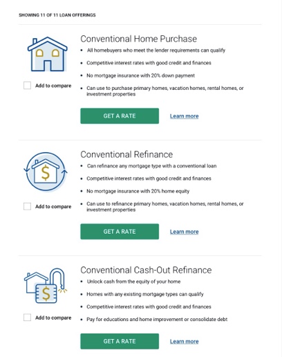
F-Pattern Eye Scanning: Card tile layouts & bullet points visually difficult to compare at a glance. Easier for our eyes to spot comparative differences upand down than across a row or multiple rows.
Products vs Services: Mortgage is conceptual and not easy to visually represent. Highly visual treatments (ex: cards, imagery and iconography) were less effective to convey meaning than in the case of tangible products (ex: REI's compare tool compares products that have photos. Investment funds don't use pictures because they are conceptual and have no visual representation).
Reduce Complexity & Subtractive Solutioning: Complex applications have their place for pre-conversion users, but the less complicated the better so as not to intimidate or lose them. These are not Financial Advisors who could populate a custom table by searching for ticker symbols. These users are still in their decision-making process, don't know our offerings, and we have about 8 seconds to demonstrate value before they bounce.
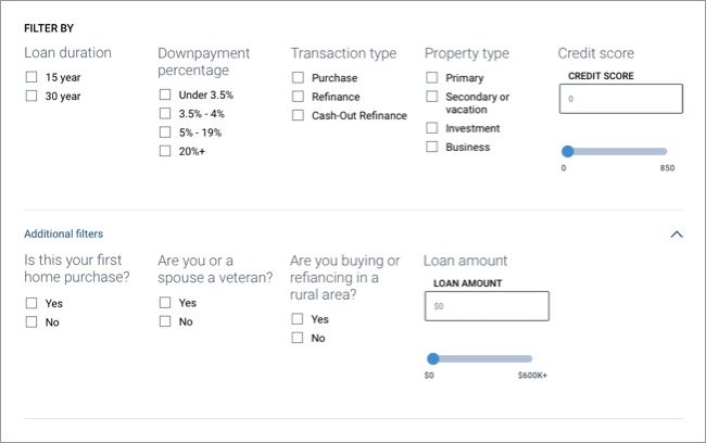
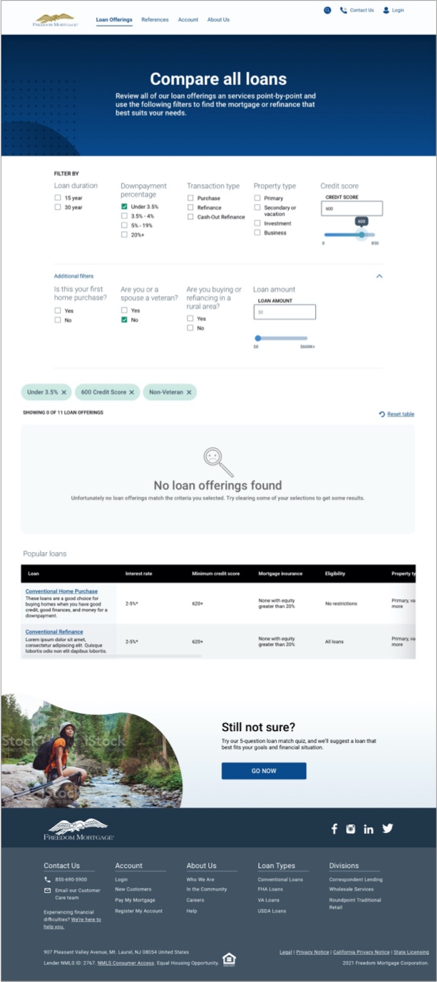
Humans tend to favor additive solutions. I'm having a problem? What can I add to the situation. Often times, subtractive solutioning is more effective, but our brains don't always work that way. I ultimately decided against the "add to compare" functionality and instead opted for an experience where the table loads fully-populated with all loans, and the filters act to reduce options and build that custom table with more subtractive solutioning.
Goal: Determine from a list of possible attributes by which to filter a list of loans, which users understand, find useful, and how they group them.
Users will primarily want to filter by the following set of criteria:
The following set of criteria was initially provided during low concept testing:
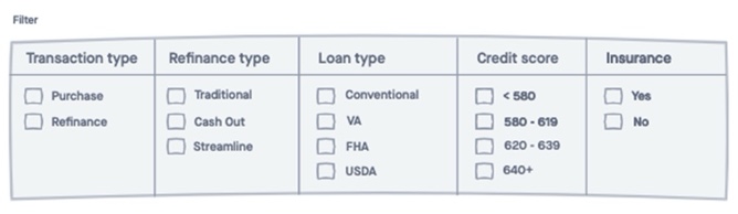
I gathered SMEs from Content Strategy, Marketing, Call Center and Digital Product to identify attributes that differentiate our loans for possible filters. I shared this list with a test group and asked them to rank them from most useful to least
Filter options |
Vote points |
|---|---|
1. Interest rates |
106 |
2. Loan duration |
79 |
3. Loan amount |
67 |
4. Downpayment percentage |
44 |
5. Credit score |
36 |
6. Closing cost required |
18 |
7. Mortgage insurance |
12 |
8. Transaction type |
11 |
9. New home apraisal |
6 |
10. Early payoff penalty |
5 |
11. TIE: Time in home before next sale & days to close |
4 |
12. TIE: Funding fee, Adjustable rate mortgage (ARM) & Product suite |
3 |
13. Balloon payments |
1 |
Points allocated depending on user ranking. For instance, if a user ranked a method first, it would be awarded 15 points, ranked second would be awarded 14 points, and so on. If a method was not ranked or ranked last, it would be awarded 0 points. The maximum number of points is 300 - 15 points possible for 100% of users.
Q: "Which filters from this list do you find confusing?"
Filter option |
Percentage of users |
|---|---|
1. Balloon payments |
90% |
2. Product suite |
65% |
3. TIE: Funding fee & Transaction Type |
50% |
4. TIE: "ARM" (Adjustable Rate Mortgage), Time in home before next sale |
35% |
5. Early payoff penalty |
15% |
Removed "confusing" items (ex: various fees, interest repayment types and product suites)
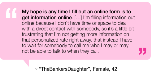
You know, since you're almost all done and all
...and make it snappy!
This became an exercise in diplomacy, persuasion, and having tough conversations with superiors
I explained how many permetations of the tool this would create to validate through usability testing, how many sessions I'd have to run across how many screeners, and how long it would take to aggregate findings in order to evaluate the best possible combinations of filters and results.
I advocated for an MVP (Minimum Viable Product), test-and-learn approach.
In a show of vulnerability and candor, I admitted that I would like to profesisonally disagree with my immediate supervisor, despite some discomfort in doing so.
I took the prototype with the combination of filters and results designs that best matched user feedback to usability testing. If users were able to complete all tasks with at least 70% success AND agreed to overall alignment with expectations, we would send this prototype to be built and continue to iterate post-production.
User task |
Answer |
Agreement or frequency |
|---|---|---|
1. (From the Home Page) Where would you go if you wanted to use a tool that compares the different types of mortgages? |
Loan offerings tab of the Navigation |
100% agreement |
2. (On the tool prototype) Free exploration task |
Generally positive sentiments |
Infrequent negative coments due to functional limitations of the prototype |
3. What do you think would happen if you click the title of a loan or refinance type in the table? |
More details about the loan (Accurate) |
100% appearance |
4. What do you think would happen if you clicked one of the filter checkboxes? |
The filter will be applied to the list and affect which offerings get returned |
75% agreement |
5. Assume you are planning to contribute a 4% downpayment and you are looking to purchase a home. Please make the filter selections you believe would update the list to reflect those criteria |
Correct selections made |
100% appearance |
6. Turn your attention to the filter set "Downpayment percentage." Select "Under 3.5%". Describe what happened. |
Users made the correct selection and described how the table updated based on the selections made (Accurate) |
100% appearance |
7. On a scale from 1 - 5, 1 being "not at all aligned" and 5 being "very aligned," how well did the outcome of that task align with your expectations for what should happen? Please verbally explain your reasoning |
5/5 Average |
N/A |
8. Add a credit score of 600 |
Correct selections made (text input OR slider interaction) |
100% appearance |
9. Turn your attention to the filter question in "Additional filters" that says "Are you or a spouse a veteran?" and select "No." Describe what you are seeing on the page. |
Correct selections made |
100% appearance |
10. On a scale from 1 - 5, 1 being "not at all aligned" and 5 being "very aligned," how well did the outcome of that task align with your expectations for what should happen? Please verbally explain your reasoning |
4.25/5 Average |
N/A |
11. Reset the tool to it's original state. Please describe what you are doing. |
Correct selections made (Un-checking boxes, reset table button, OR exiting out of the filter chips) |
100% agreement |
12. On a scale from 1 - 5, 1 being "not at all intuitive" and 5 being "very intuitive," how intuitive would you say the loan compare tool was? Please verbally explain your reasoning |
4.75/5 Average |
N/A |


