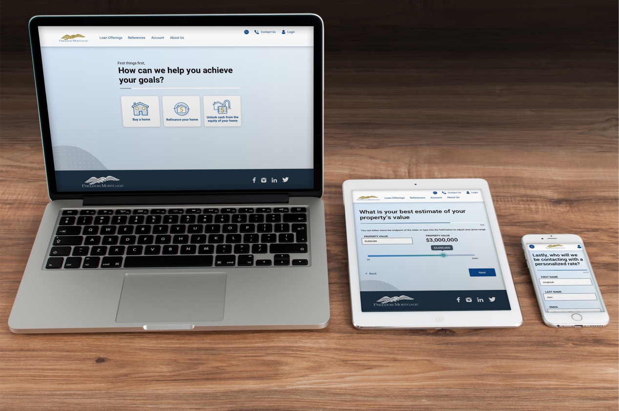
Freedom Mortgage doesn't have a fully online home-buying experience...yet! The first step in the current-state process to go from "user" to "client" is to engage by either calling or submitting a lead generation form to receive a call-back from a loan officer.
UX/UI Design | UX Research

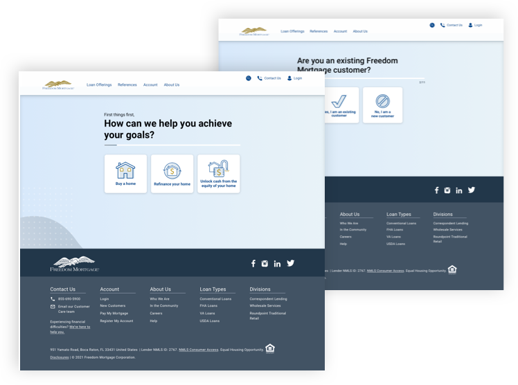
Freedom's website captured leads through a form that toggles between different products and re-populates the form with fields depending on your selections-a rather clunky experience.
Further, exploratory research surrounding the path to purchase journey showed that the earlier in the journey users were, the less likely they were to expect to see the form at the times when they did. For example,
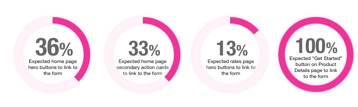
...when in fact, all of these locations linked to the lead gen form.

Test assumptions about tried-and-true Product Details page Information Architecture:
Method: Unmoderated qualitative user interviews.
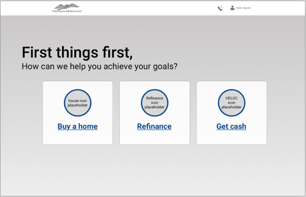
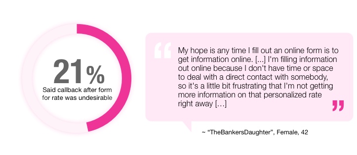
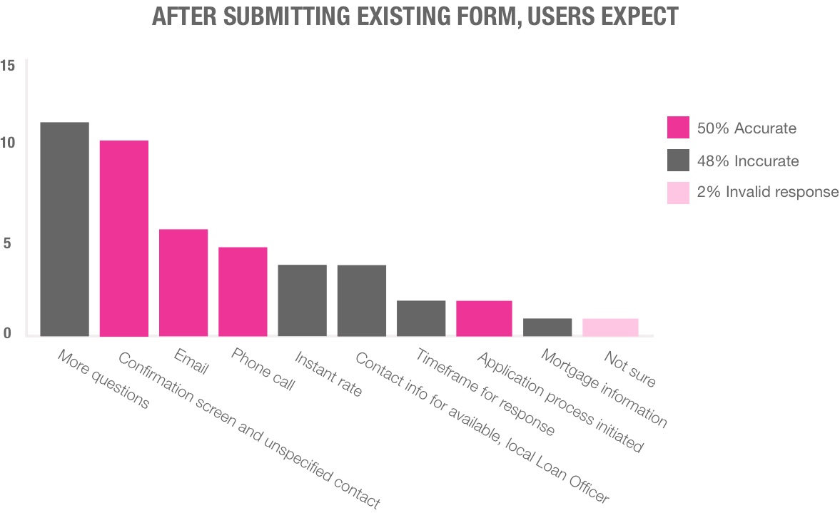
Users were asked to describe their expectations regarding the process of submitting a form to the lender to get a personalized rate
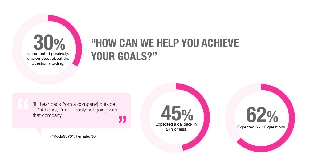
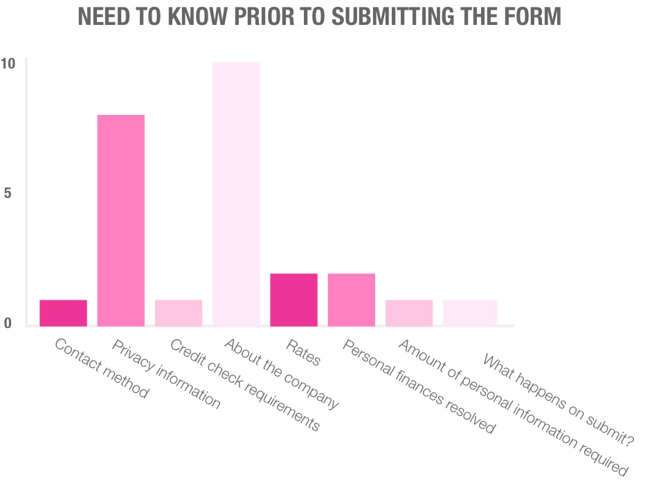

While some cited multiple examples of expected contact methods after submitting their forms, the vast majority both expected and preferred to receive an email with a rate quote.
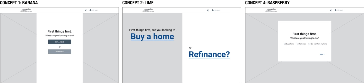
Tested the following concepts through InVision prototypes for a variety of desirability factors and usability. Used combination multiple-choice voting, likert scale assessment, and click-path tests to assess which experience best aligned with users' expectations and which was the most efficient method in terms of time on task and accuracy of outcome.

All users were able to complete the form prototypes accurately. A few users made incorrect clicks at some point while interacting with concept 1 "Bard," but were able to self-correct and complete their tasks.
Concept 1 "Bard" and Concept 2 "Rogue" had the same questions, but Concept 1 "Bard" was all on one single form and Concept 2 "Rogue" introduced the progressive layout. Click-path testing proved that the progressive form layout was, in-fact on average faster, and more accurate than having all fields on one page, despite some initial skepticism from both stakeholders and some users in the test group, and some assumptions made about page load time.
While concept 2 "Bard" and Concept 3 "Druid" look visually similar, Concept 3, "Druid" asks additional questions about budget, credit score, refinancing goals, and timeline. We included this concept because the business had a desire to capture more data. We found that asking more specific questions made users feel more confident that the end result would be a more accurate rate and greater overall trust in the legitimacy of the company.

THe purpose of this test was to glean insight into the user's expectations regarding various touchpoints and outcomes of the "Path to Purchase" journey, with special focus on the Lead generation form.

Performance results TBD, as the form design was launched into production as part of a 50/50 split A/B test against the current state of the form on May 25, 2022.
Created template for future progressive layout interactions, including a path-to-purchase tool that is in the process of being pattented
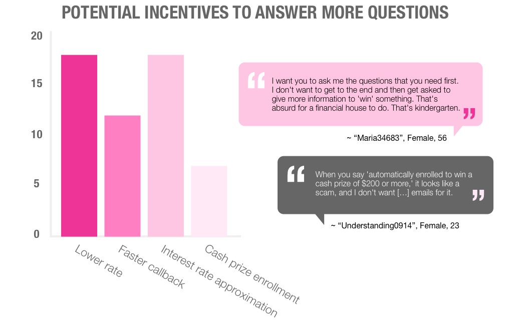
Caputring more information in salesforce to reduce call duration and thus both satisfy customers and free up the Loan Officer's time to make/take more calls. Adding these questions is theorized to have the added benefit of instilling trust in our brand identity, as was mentioned in research.
While the sliders were less popular than the text input fields for numeric responses, they provide additional options for haptics and mobile usage.