Role
UX/UI Design | UX Research
The problems
User problems
- I want to be able to review a master list of products and services offered
- I want to easily locate what I need within seconds
- I want a clear description of each loan type, my eligibility, the differences between them, and the ability to make an informed decision about which product I should choose
- I want to be able to compare products and rates from different lenders at a glance
Business problems
- We want to move into loan origination
- We want more leads
- As a business with a very young web presence, we would like to modernize
- We would like to build a fully web-based home origination and refinancing experience
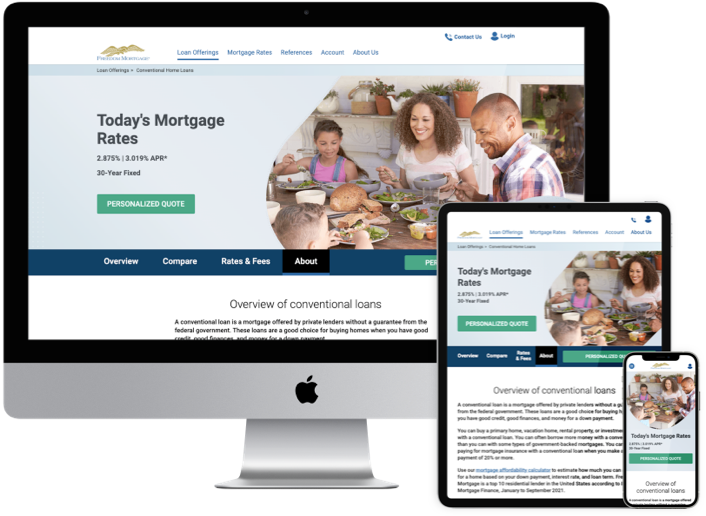
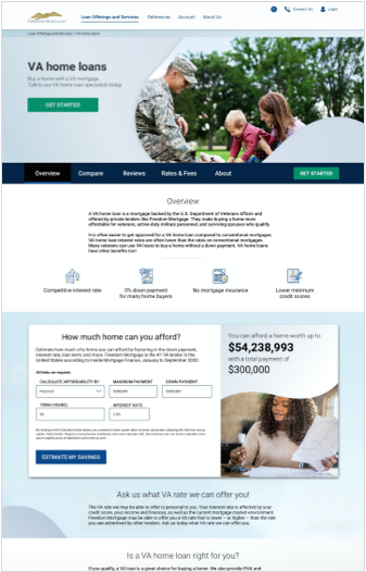
Before
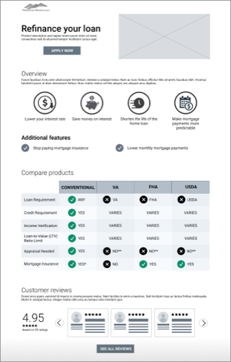
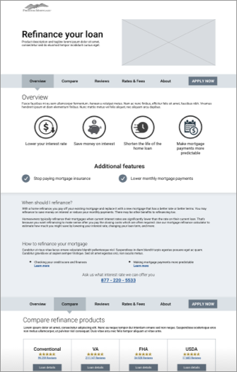
After
The process
Test assumptions about tried-and-true Product Details page Information Architecture:
Assumptions
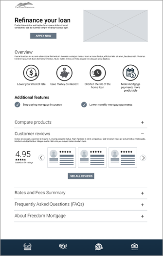
I. Banner area
- Product title
- Product image
- Tagline
II. Apply - link to rates and disclosures
III. Page content
- Overview
- Benefits / specs / product details
- Compare other products
- Customer reviews
- Rates, fees, costs etc.
- FAQs
- Why us
- Apply button at the end of the page
Test methods
I. Click-path testing: Test for efficiency of Information architecture, information order and module design
II. Treejack testing: Determine locations for different types of information (what goes in rates & fees vs FAQs vs Product overview and waht level of complexity is desired in each module?)
III. Desirability testing: Module designs for rates and fees, FAQs, Comparison tables (drawers, table complexity, iframe, cards) and order of information
Concept 1: Laborador
Concept 3: Mastiff
Concept 2: Chihuahua
Concept 4: Beagle
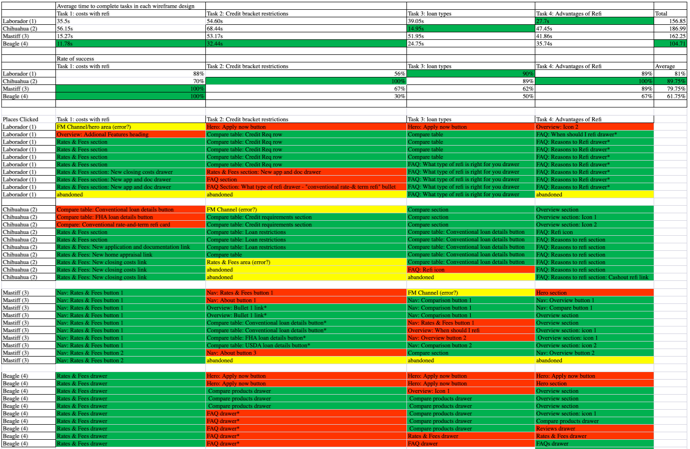
Click path test results
While concept 4, "Beagle" had the fastest completion rate by users, it had the lowest overall accuracy. Concept 4, "Beagle" collapsed the most information with significantly fewer context clues and supporting content. Concept 2, "Chihuahua" performed the best overall with all tasks passing the minimum 70% agreement threshold.
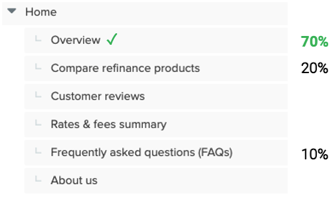
Treejack test results
The "tried and true" Information Architecture of a Product Details page had some room for interpretation. I conducted 2 rounds of Treejack studies to determine where a user would go to find information that could fall into multiple categories.
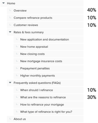
Tree1, Task 1
Where would you go to read about the advantages of refinancing your mortgage?
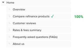
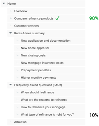
Tree1, Task 2
Where would you go to read about the differences between refinancing options by loan type?
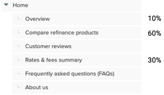
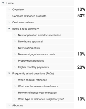
Tree1, Task 3
Where would you go if you wanted to learn how your monthly mortgage payment would be affected by refinancing your loan?
Tree2, Task 1
Where would you go to read about the advantages of refinancing your mortgage?
Tree2, Task 2
Where would you go to read about the differences between refinancing options by loan type?
Tree2, Task 3
Where would you go if you wanted to learn how your monthly mortgage payment would be affected by refinancing your loan?
Desirability tests
Used a combination of desirability test methods including "pick 3 adjectives" from the Microsoft Desirability Toolkit (the consolidated list of 18 adjectives), likert scales for attributes like "transparency," and "ease of use," and multiple choice voting. Some examples of concepts tested include the following:
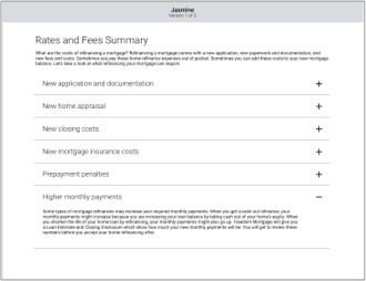
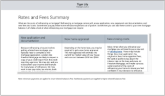
Rates and Fees
Concept 1: Jasmine" - Drawers
Concept 2: Briar Rose" - Cards

Concept 3: Tiger Lily" - iFrame
FAQs
Concept 1: "Alice" - Drawers
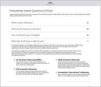
Concept 2: "Giselle" - Icon tabs

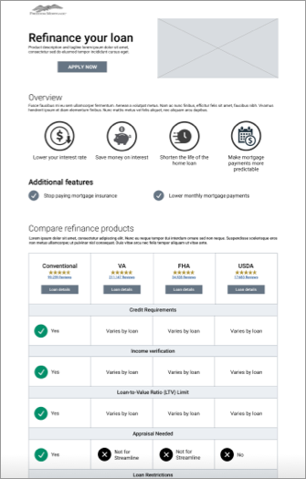
Loan comparison
Concept 1: "Van Gogh" - Full comparison table

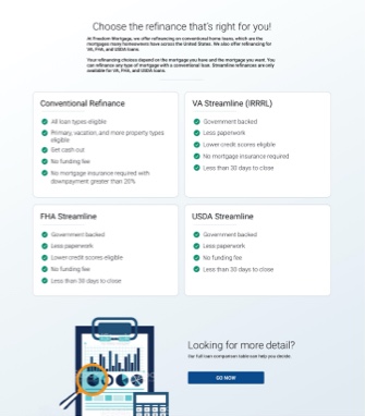
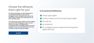
Concept 2: "Monet" - Top 5 points of comparison for all comparable loans
Concept 3: "Degas" - This product only
Key findings
- 70% of users requested Calculators, rates or numbers, which was consistent with studies conducted across the rest of the external site
- Some users expressed distrust in the reviews that companies post on their site, as they believe them to be curated to exclude negative reviews. Many cited the importance of reviews, but attested to looking for them on alternate platforms.
- Several users mistook the overview icons for buttons. Similar icons were used later in the page with clickable functionality.
The solution
Key features
- Inclusion of calculator module, which users confirmed satisfied their desire to see rates. Business restrictions limited our ability to share rates for all loans at the time of the first page release.
- Exclusion of Customer reviews due to distrust of reviews on a company website if only positive reviews are shown. The business could not reach an agreement about sharing reviews with ratings lower than 3.5/5 at the time of the first release. The business was also negotiating a new vendor for the reviews service and the decision to include reviews was deferred to a later date.
- Persistent apply to increase click-traffic. While persistent apply functionality does not necessarily perform well in testing as the functionality is difficult to prototype, our team took a test-and-learn approach to see if the persistent apply could compete in clicks with the previous method of "sandwiched" apply buttons at the top and bottom of the page.
- Reduction of the full comparison table to a "top 5" bullet points approach, but with a link included to the full comparison table. While this module design reached the required 70% agreement, a near 30% of users still wanted a fuller comparison, so we provided the ability, a click away.
- Re-imagined design patterns in a Brand version 1.5 iterative approach. Included update to icon style, aspirational photography strategy as well as hierarchical image shape styles, brand color cohesion, implementation of font hierarchy, introduction of new card styles, tab styles and more.
Outcomes
- .COM saw a 15% uptick in Refinancing leads from pages that the UX team worked on in the Path to Purchase journey over the last year. In prior years, the company lost more money on supporting .COM than it earned, which has not been the case since UX started delivering path to purchase journey work in Q2 2021
- Decision to simultaneously re-work the site navigation to better align with user expectations of Information Architecture, and to use the opportunity to implement a "mega nav."
- User scroll depth increased past to the overview section to an average of about 50% depth into the page. The new designs were released in a 50/50 A/B test against the original version, which showed the average user not scrolling past the Overview section.
- The aforementioned 30% of users who wanted to see a full comparison table (the "Careful considerer" user archetype) coupled with the consistently echoed desire to self-pace as much mortgage education as possible before making a call to a lender (among other factors) led us to continue our work on the path to purchase journey, including the Product Suite pages, Category pages, a Product match quiz, progressive forms, and a Product Comparison Tool.
- Continued iterations on re-imagining the company brand strategy through the development of a design system.
- The persistent apply received more click traffic than the stationary apply button in the hero banner