
Out Professional Engagement Network resource group
The Vanguard group offers resource groups to their employees, including the “Out Professional Engagement Network” (or “OPEN”), which connects LGBTQIA+ and ally employees with business and educational opportunities, news, volunteering opportunities, and more. The clients expressed a desire to update the look and feel, but also remarked that many of the members had expressed a desire to be connected to local events, support groups, internal and external news, and share or read about one another’s experiences-none of which, the site facilitated at that point in time. We are a global company, so the site leads expressed a need to distinguish the location to which each piece of information pertained.
We worked as a group to determine some of the top user goals for the site through a combination of reviewing then-current site activity (top hits), polling users for most desired information on the OPEN site and working with other resource groups to learn what kind of information was most popular with their users, which included:
When it was time to establish a working design, we made sure that user testing was a consistent part of our process by socializing layouts with existing users as well as new, potential users. During this process, we watched our users interact with our prototypes, asked what they thought the purpose of a screen was, what they noticed first, and to perform basic site actions to determine whether or not our proposed processes were intuitive.
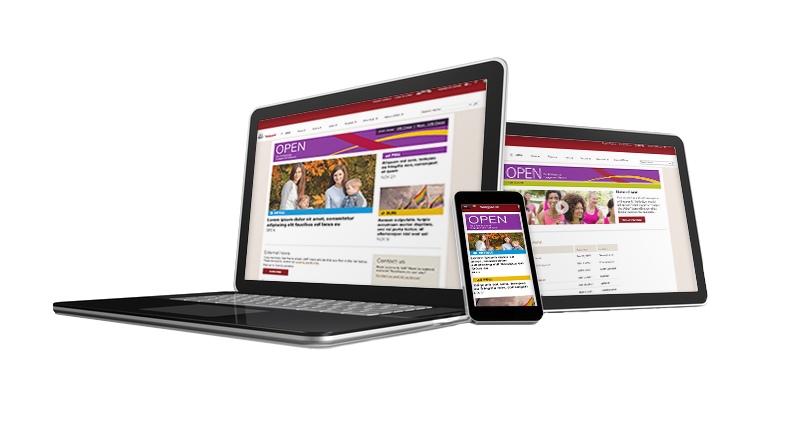
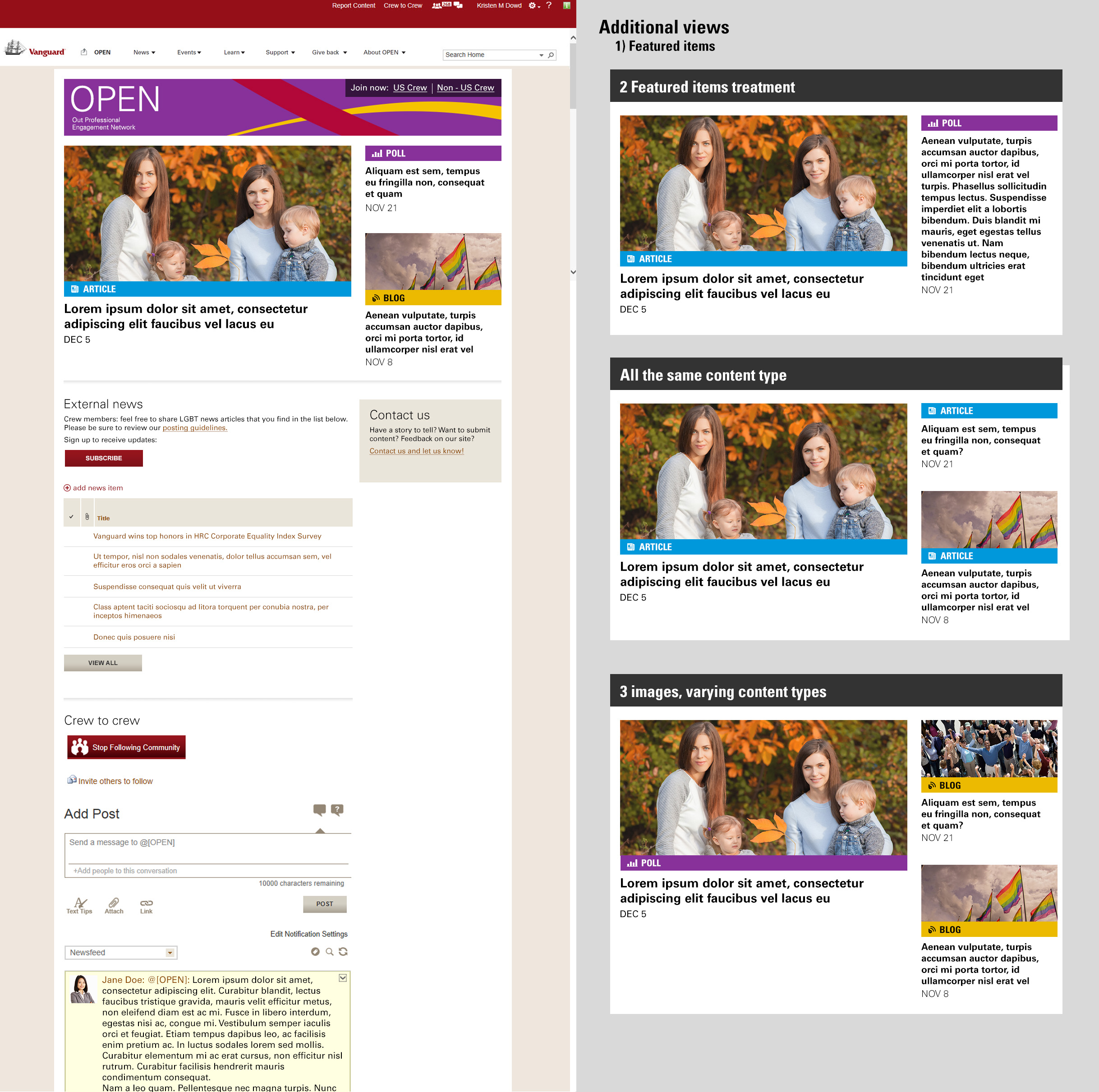
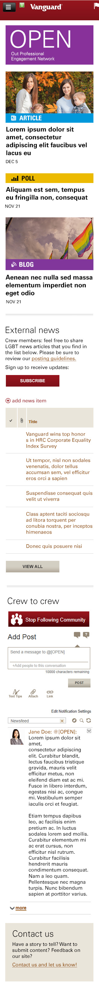
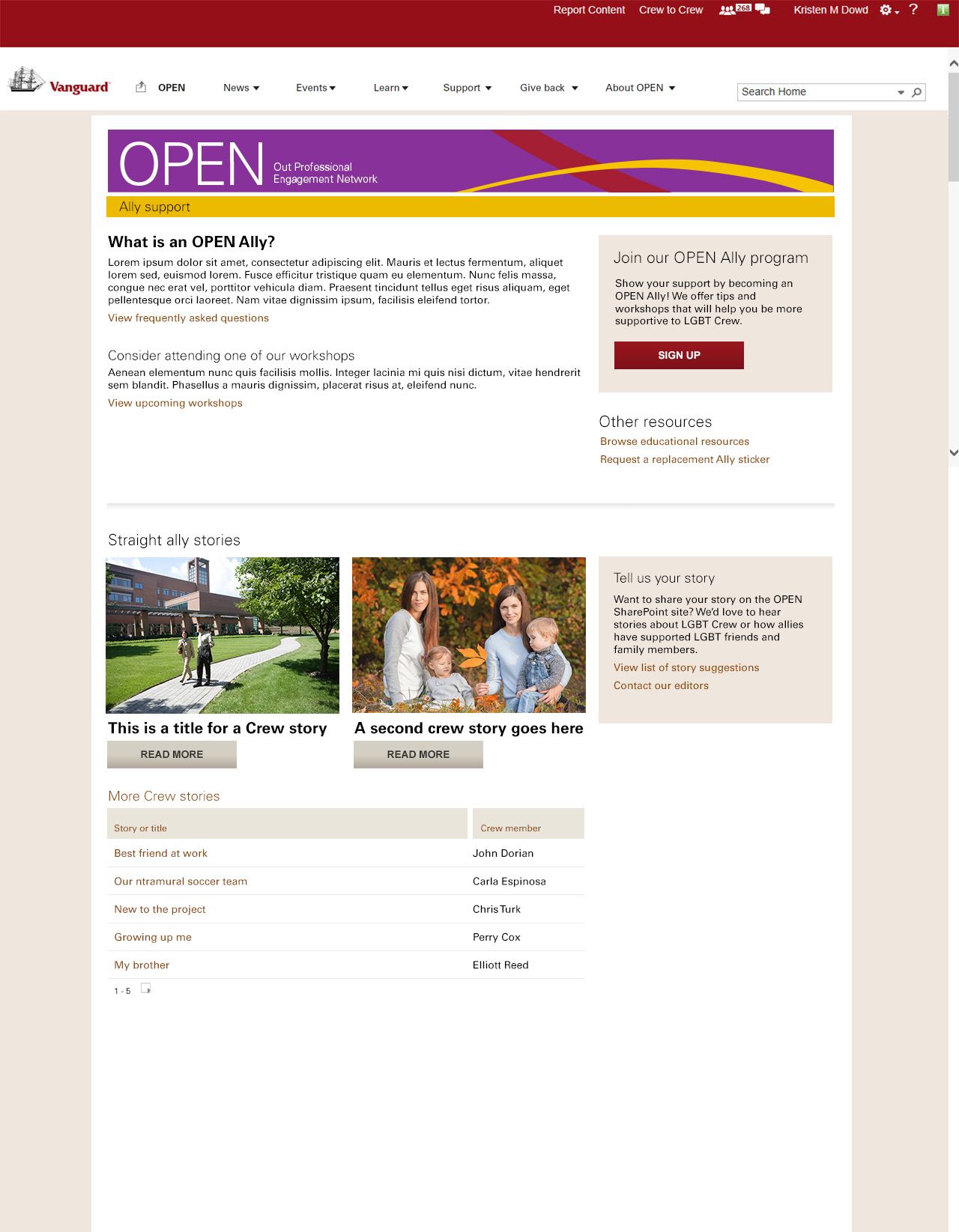
Our team decided to utilize the shell of the existing internal site, but to wrap our new navigation and design around it. We addressed one of the key problems with the previous site, which was that it was not obvious how to join the group, or that there was a different process to do so for US versus non-US sites, I re-designed the “sign-up” functionality to have prime real-estate at the very top of the page on the banner. This new version featured strong contrast between actionable and pictorial content, so as to combat “banner-blindness.”
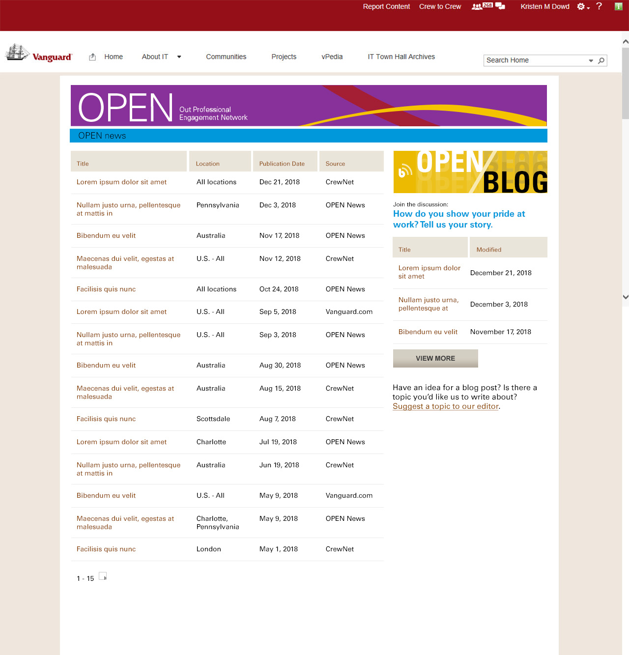
The architecture of the home page went from directly echoing the main navigational points, to primarily featuring community news while treating the navigational points as secondary. Our users did express some interest in potentially visiting the site for community-related news, but it was rarely the #1 user goal. The reason we did this was because the client stressed that news in the community had potential to affect every other aspect of OPEN —for example, news that impacted safety —and it would thus be deemed most important, over all other site goals. The deliverable that I created for this requirement was a custom component that pointed to a SharePoint list that the client would be responsible for maintaining. This list contained a featured image, title, short description, link to the resource, and content type (i.e. article, blog, poll).
