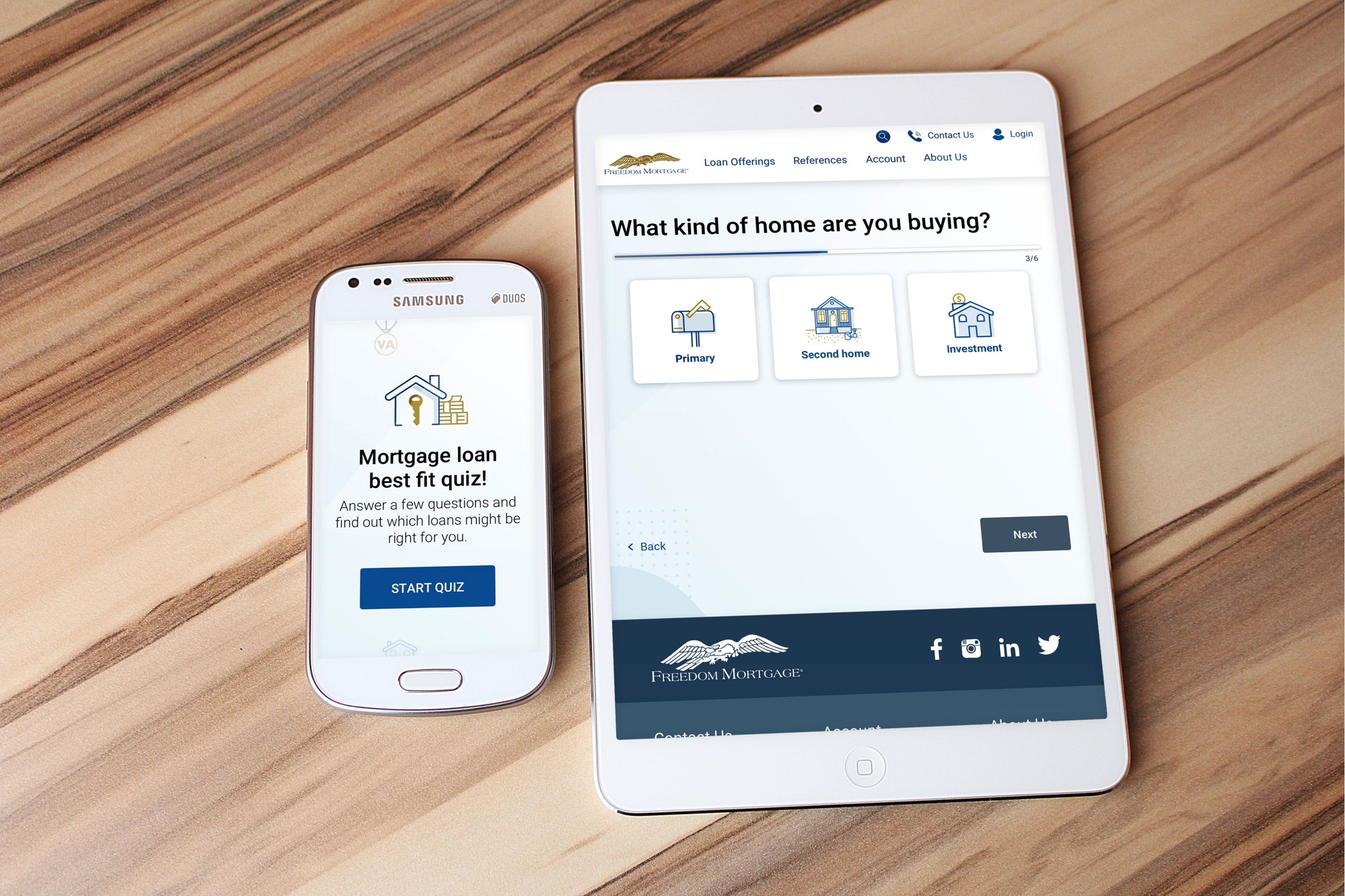
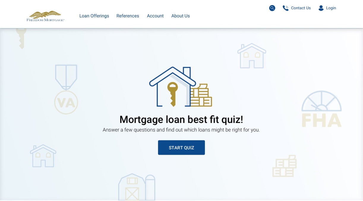
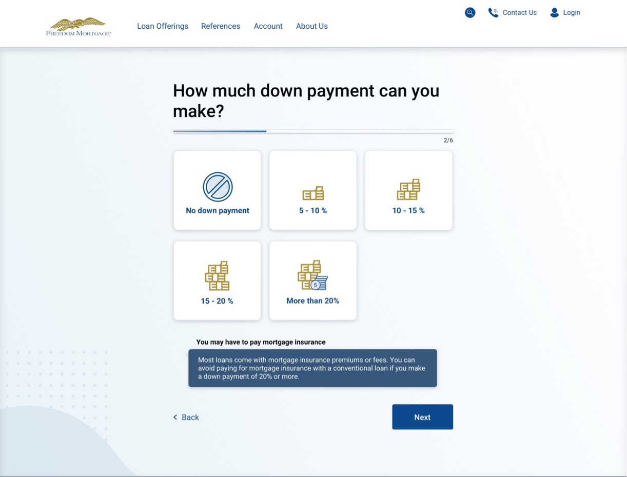
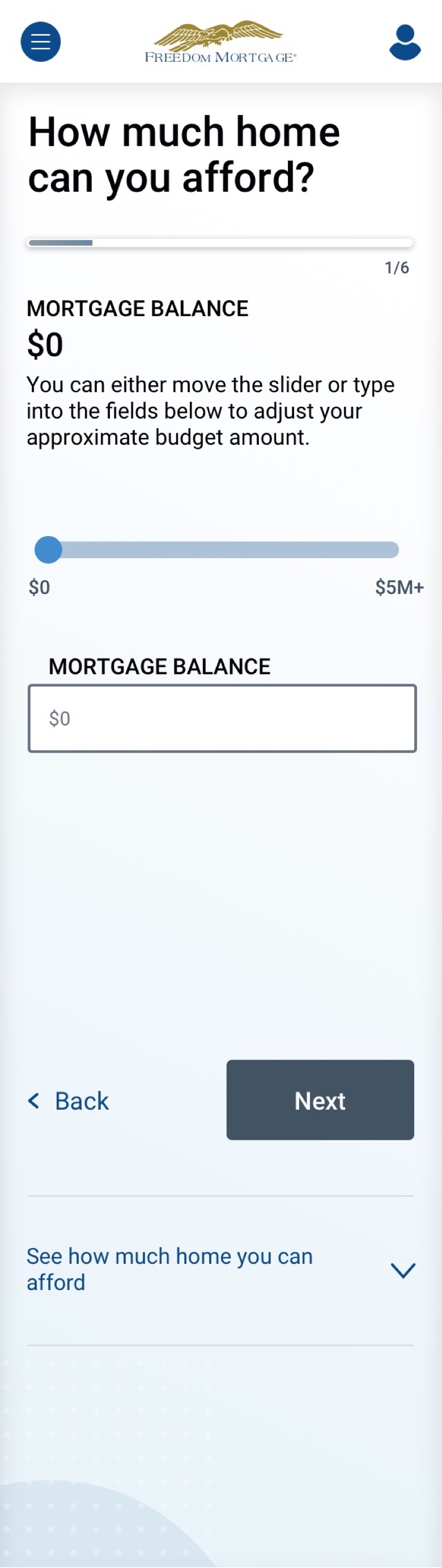
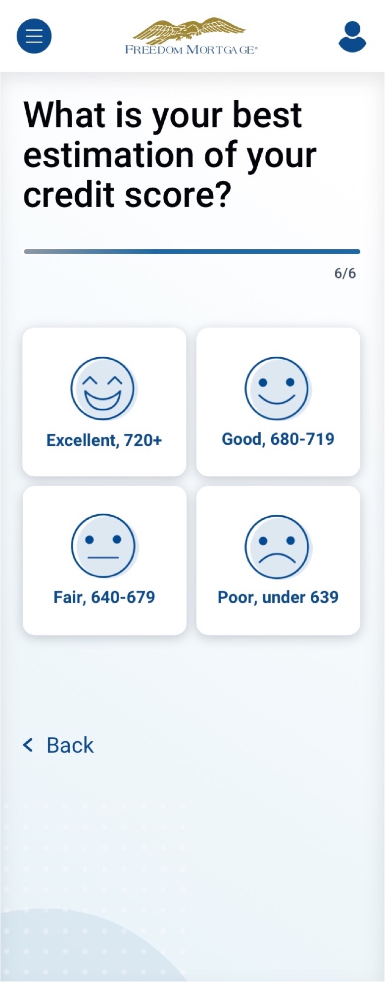
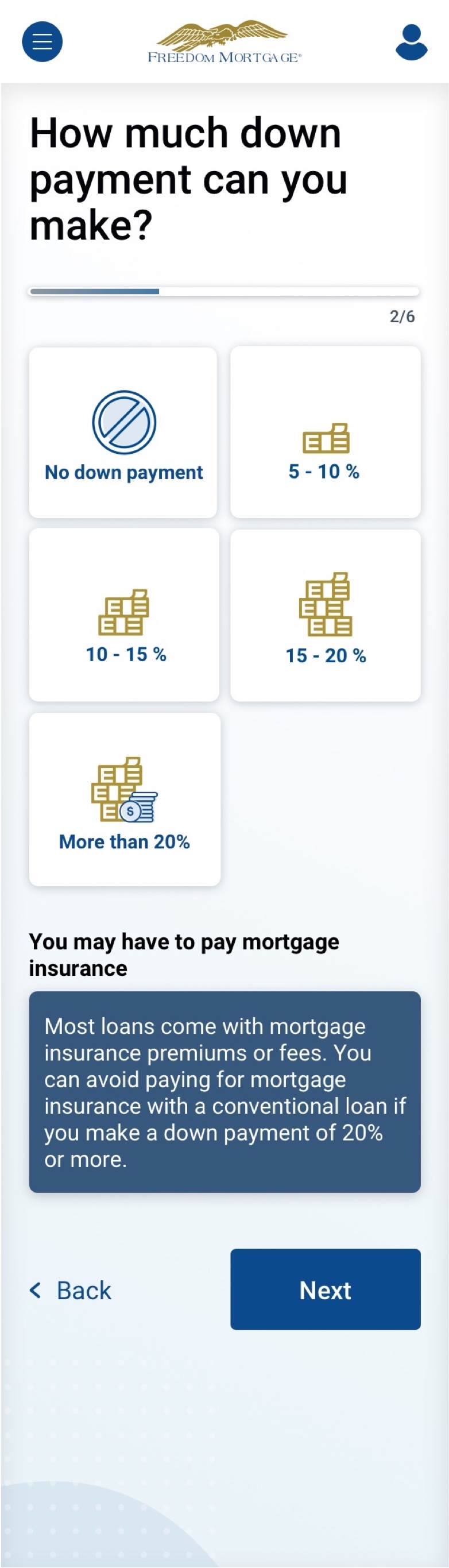
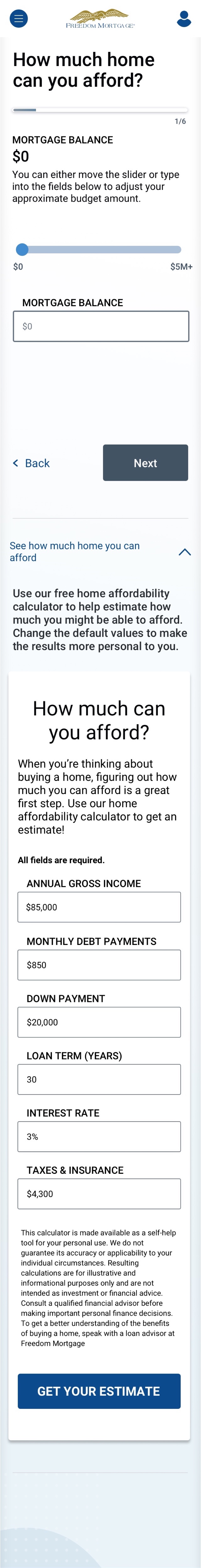
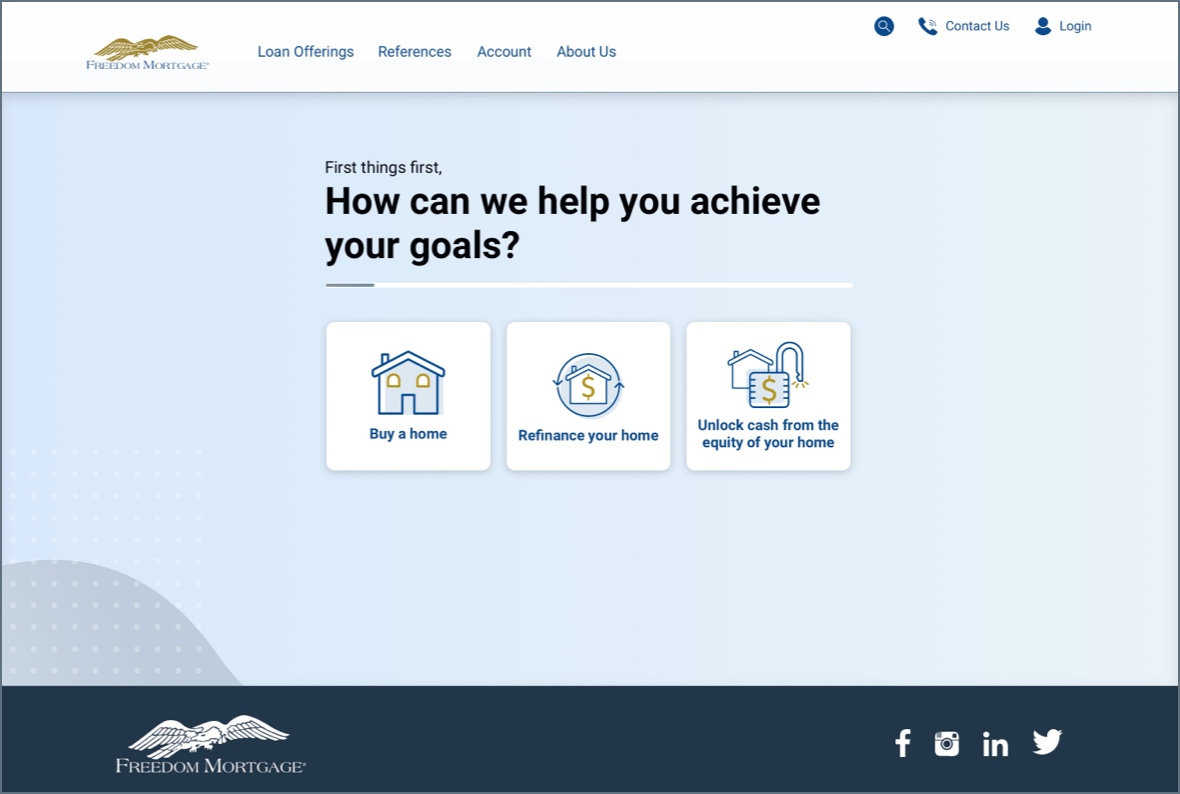
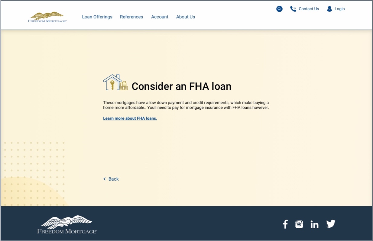
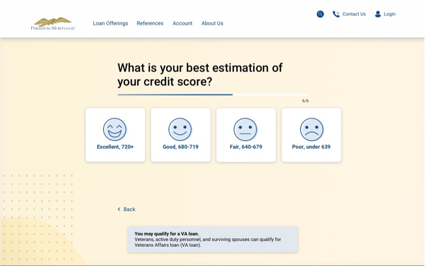
Not sure which loan is right for you? Take a 5-question quiz to get matched with a loan type that best fits your financial goals.

UX Strategy

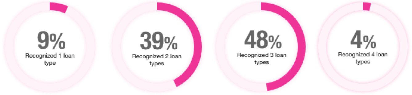
Users don't understand the differences between our loans and loan suites, especially early in their decision-making process, as evinced by exploratory research conducted as part of the Loan compare tool
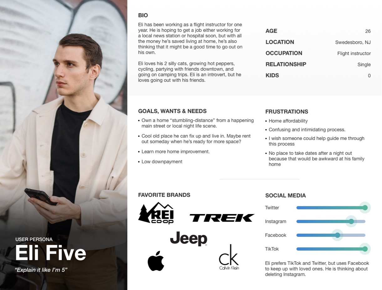
Some users prefer to do their own research to learn which loan type best fits their circumstances, and those users are best suited for the Loan Compare Tool, which gives the user control over inputs that affect the full spread list of offerings. Other users, however, prefer to be guided through the loan selection process, which is where the quiz comes in. Think of our friend, Eli Five.
How might we educate our users in a way that is fun and approachable?
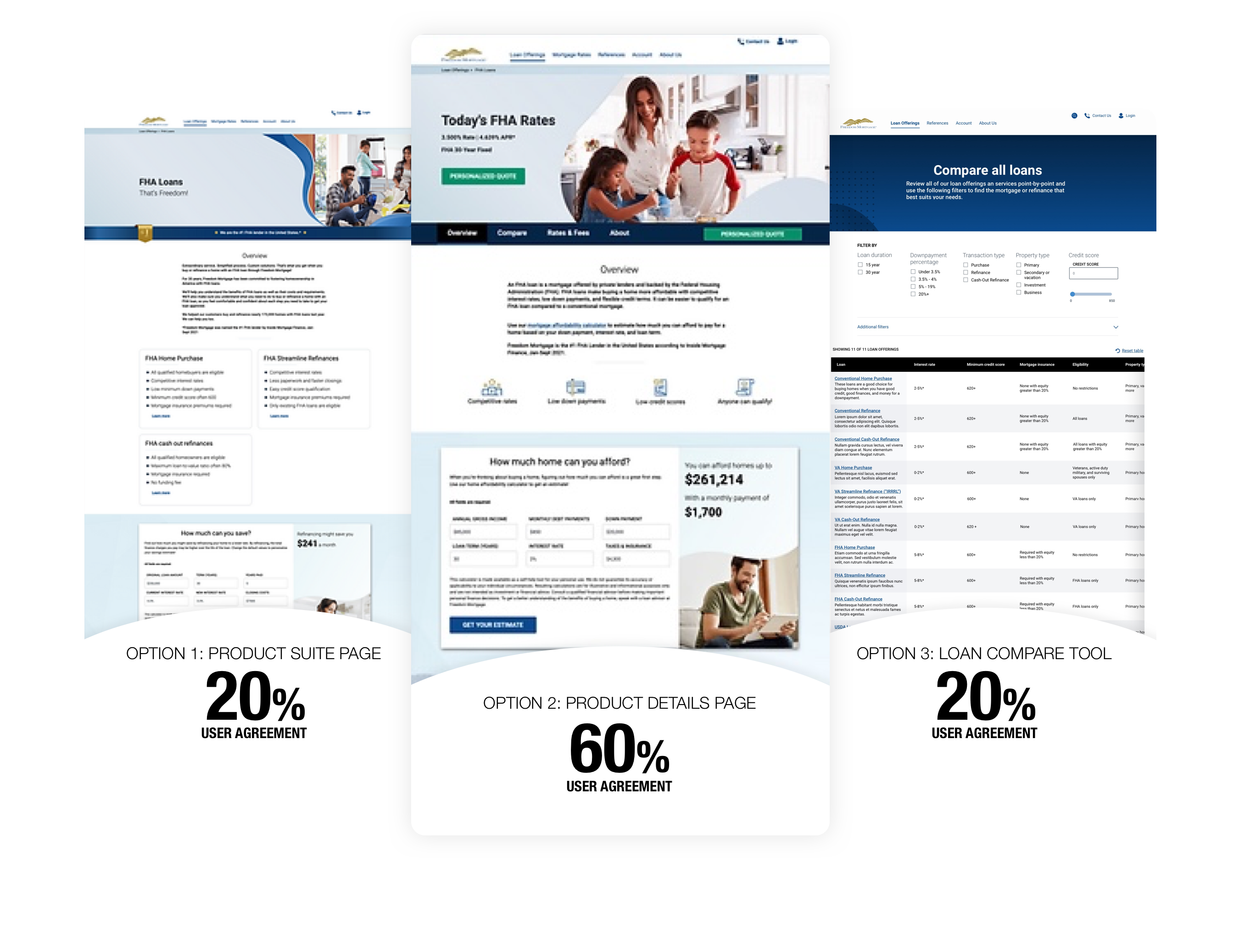
This project followed a condensed lifecycle, as the primary exploratory research was conducted as part of the Loan compare tool's exploratory research phase, and the design followed the progressive form template developed as a product of the Dynamic Forms project.
Initially, the project seemed pretty straight-forward. All the initial research was done, Content Strategy would develop the questions, and the design template was already created. All the Junior Designer needed to do was plug the inputs into the template and maybe change the color a little.
Simple, right?
DISCLAIMER: The Junior Designer was responsible for developing her own test plan. My responsibility was to advise on the high-level strategy and suggest some questions/formats in order to prove or disprove our shared hypotheses about the desirability of the quiz, where it should live on our site, how it should function, and what the end result should be. I did not see the final test plan that she launched until after she had finished aggregating the results.
Showing top 2 of 9 potential options:
My initial advice was that it's not a useful data point to ask a user if they want something, because users always say "yes" to new features.
Do I want my loan servicer to deliver me ice cream in bed? Of course! Is it going to help me choose a loan? Well...sometimes I do find that I'm more capable of making a decision on a full stomach...
And you can't ask a user "what" they want because, unless they are in the industry, it is incredibly difficult for users to self-provision solutions to their problems. The most efficient way to ask what users want is to ask them to rank potential offerings from most to least desirable.
When I asked her why she still used this question, despite my advice, she said that she was trying to prove the disparity between what users say they do and what they actually do - i.e. 100% of users said they would be interested in taking the quiz, but 0% had taken such a quiz.
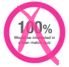

I advised her that while she may be able to prove correlation, it is extremely difficult to prove causality. Have users truly not taken a mortgage match quiz because what users say they do is different from what they actually do, OR is it because no such quiz currently exists?
Because no such quiz currently exists.
Despite some advised modifications to her test structure, she was able to identify key qualitative data points and gaps in user needs.
The Junior Designer brought the designs from her first iteration of exploratory research to a design review with myself and the Sr. UX Researcher. Her main concern was how to accommodate the users' request to provide more context around how their answers affected their ultimate recommendation.

We were concurrently in the process of developing the first version of the Design System. Our approach was to audit what existed on the site after a certain cut-off date and not introduce new components unless absolutely necessary.
We also had a limited budget for developmental efforts to create new components for this particular project.
With that in mind - how might we solve the users' problem if there were no constraints?
No idea is a silly idea. Throw it on the wall and see what sticks.


Somewhere along the line, my design manager looked over my Junior Designer's work and advised that the yellow wasn't working and that she should change it. I saw this as an opportunity to exercise my style as a leader and strategist.
I told the designer that while I agreed that the yellow was fighting with our blue iconography style, it wasn't feedback that I felt necessary to share as it was a minor UI preference that did not compromise the strategy or experience of the quiz. I ultimately shared my personal opinion and empowered her to make the final call on the matter.